


RESEARCH & REPORTS
Long Copy vs Short Copy for Direct Mail: Data-Driven Insights, Trends, and Examples
For this article, we closely examined the postcards, envelopes, and self-mailers from 21 industries to understand how the copy length has evolved over time.
In the last decade, our average attention span has gone down by 50 percent — which explains why you prefer videos that are less than 10 minutes long or spend no more than 4 seconds on a webpage. And, yet, one of the longest-standing debates amongst marketing professionals continues to be about long copy vs short copy. There are some compelling arguments on both sides and we decided to put them to the test.
For 20 years, we have collected, curated, and analyzed direct mail from across the globe to stay abreast with the latest trends and best practices. For this article, we closely examined the postcards, envelopes, and self-mailers from 21 industries to understand how the copy length has evolved over time.
The idea is to make a note of how things have changed, and use that data to determine what’s better — long or short copy. Let’s get started!
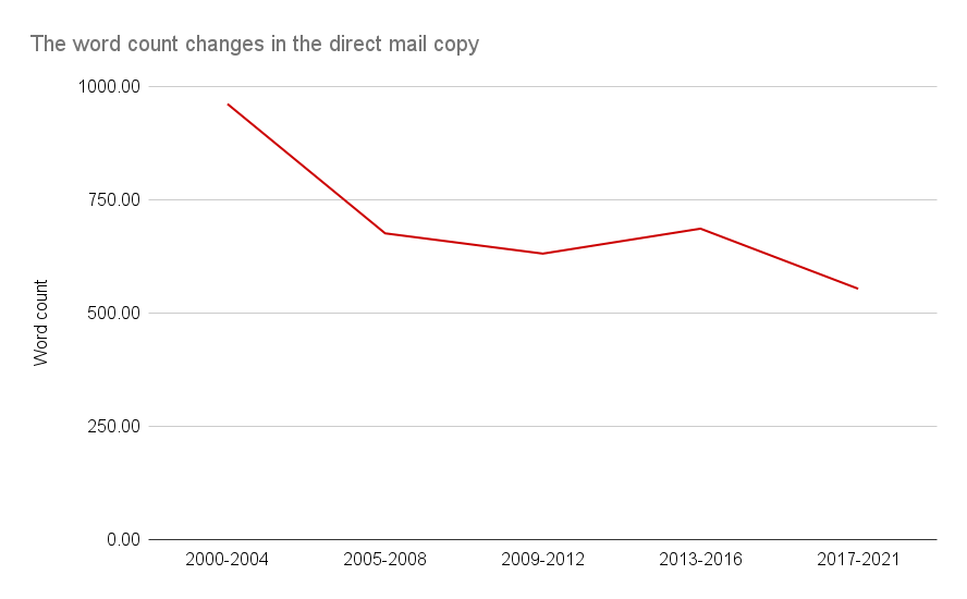
Trends in Direct Mail Word Count from 2000 to 2020
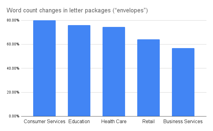
The average word count in envelopes, postcards, and self-mailers has decreased by 124.22%, 30.13%, and 29.24% respectively in the last 20 years.
 For envelopes, Consumer Services (79.94%), Education (75.99%), Health Care (74.48%), Retail (64.24%), and Business Services (56.92%) and Arts (45.54%) observed the most significant drop in the average word count.
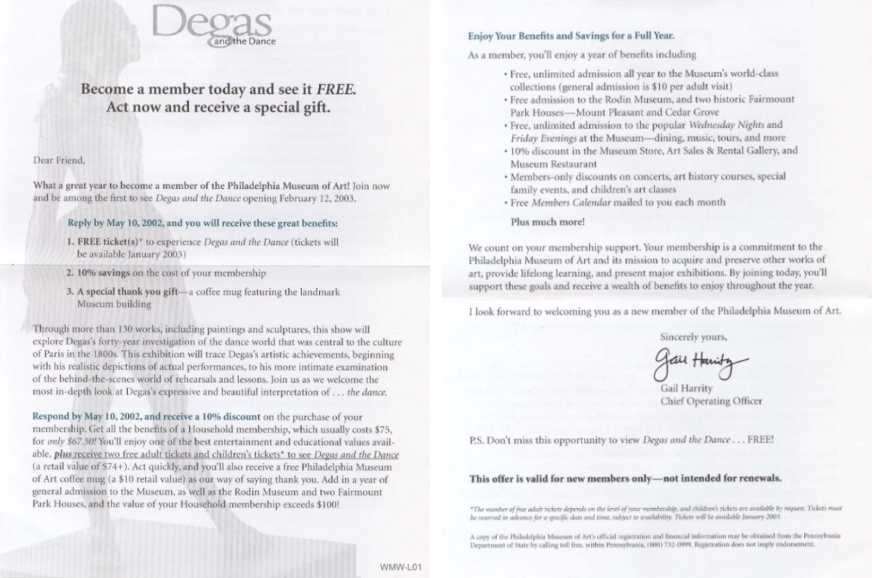
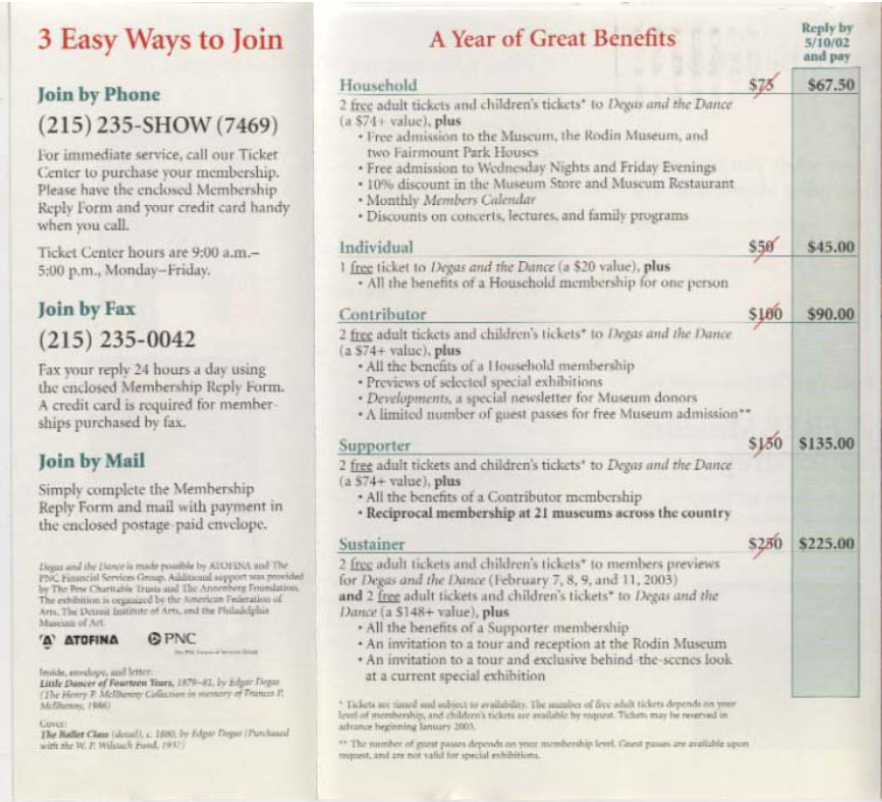
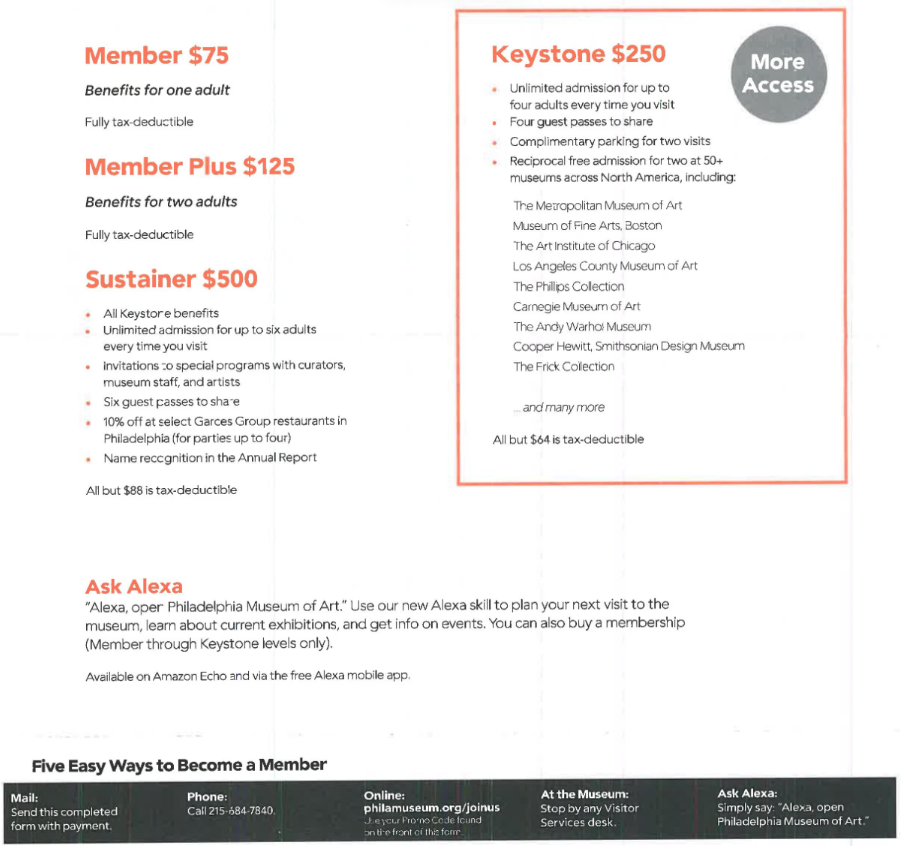
Museum of Art Philadelphia – word count change
Let’s consider the following envelopes from the Museum of Art Philadelphia.
2002
2020
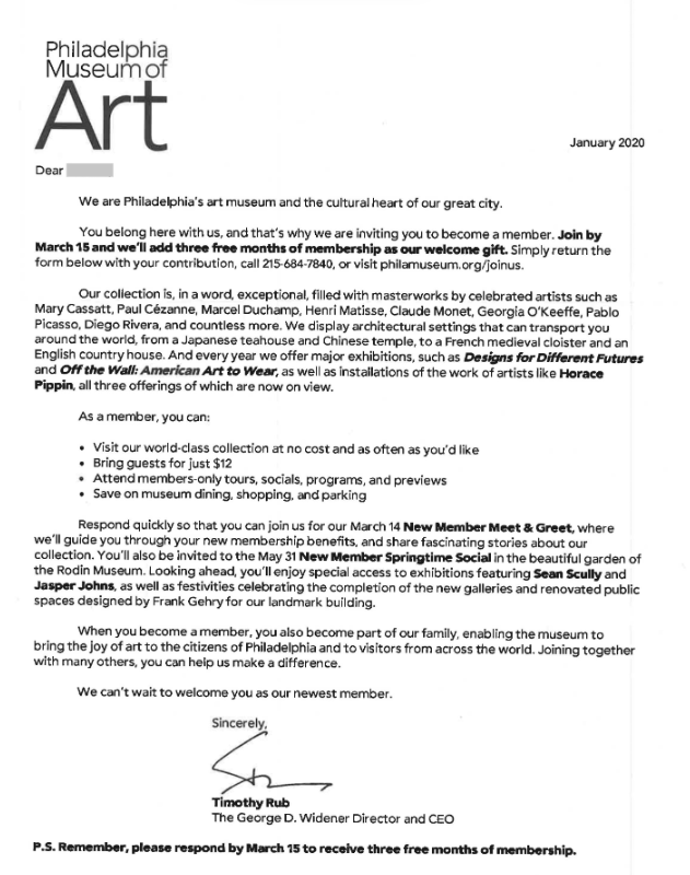
In both cases, the communication urges people to sign up for membership and receive exclusive privileges from the museum.
You’d notice that even the information shared in ’02 and ’20 envelopes is pretty similar — how to become a member, membership verticals available, members-only events you can attend for free, etc. However, presentation-wise, the content in recent years comes across as more polished, succinct, and formatted to take up less space.
In the former, there’s a detailed description for each tier. In comparison, the ‘20 example, in spite of having more tier options, uses shorter sentences for highlighting the membership benefits that the customers can avail under each tier.
- Memberships and ways to join
2002
2020
Bistro MD – word count change
- Bistro MD is another great example.
2009
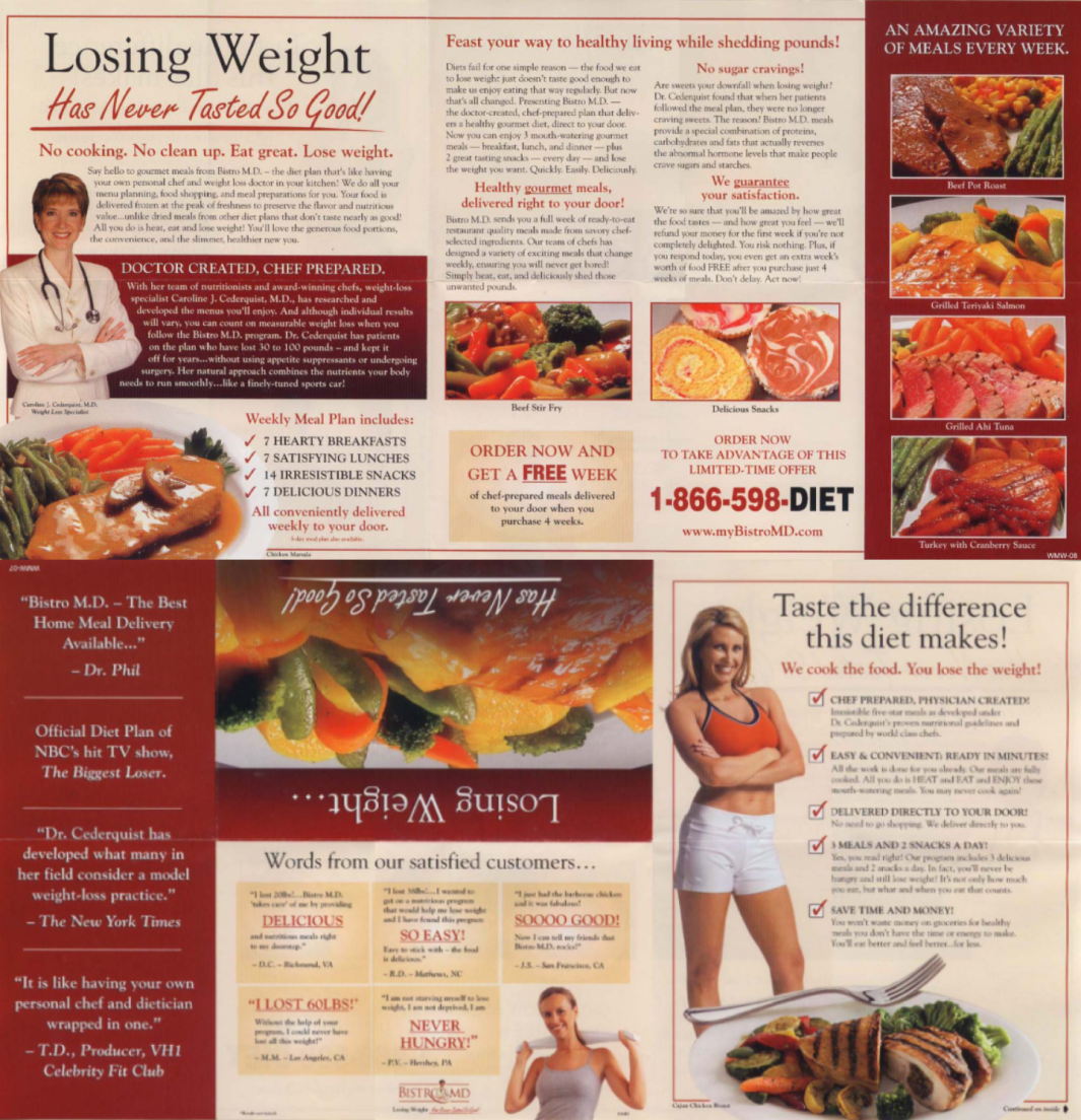
2021
Looking at these envelopes from ’09 and ’21, it’s clear that the copy has gotten noticeably shorter while the overall concept and style remain the same. For example, both of them include a picture of a medical professional to emphasize that the program was “created by a weight-loss specialist”. There’s also a dedicated section for customer feedback. However, in ‘09, the presentation is more polished. Instead of relying on long-drawn paragraphs, the copy follows a checklist format that breaks the text down into well-organized, readable chunks to keep the readers engaged.
You can check out more direct mail envelope ideas to boost your open (and conversion!) rate.
For postcards, the average word count decreased the most in Media & Publishing (47.97%), Nonprofit (41.79%), Recreation & Travel (41.53%), Business Services (41.23%), and Education (38.28%) sectors.
On the other hand, the word count increased by a huge margin for Restaurant (98.76%) and Arts (27.25%).
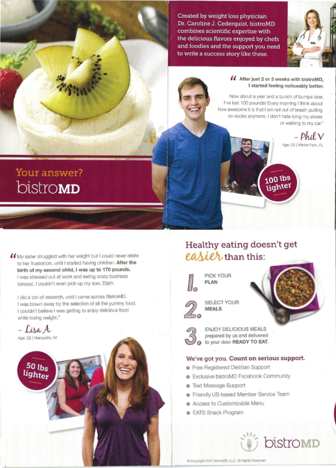
Dominos – word count change
- Take Dominos, for example.
When comparing the two postcards from ’15 and ’21, you’d notice that the former appears to have a shorter copy length.
2015
2020
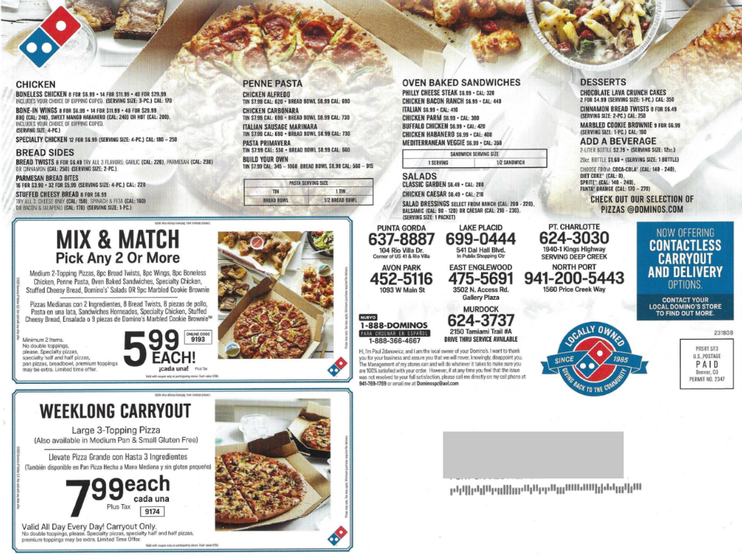
In these 5 years, Dominos, like all other restaurant franchises, must have opened more outlets and/or added more food items to their offerings. Not to mention, with delivery apps gaining popularity, customers don’t want to jump through several hoops to place an order. They prefer having access to the menu, active discounts/coupons, and contact information all in one place. The ’21 postcard checks all these boxes — it includes a quick snapshot of their entire menu, details of ongoing offers, and has multiple numbers listed under contact.
Nordstrom – word count change
- On the other hand, if you look at Nordstrom—the famous American luxury retail chain, the envelope copy has visibly decreased between ’12 and ’20.
2012
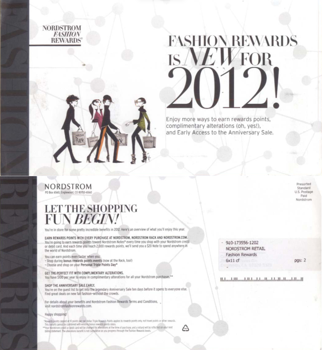
2020
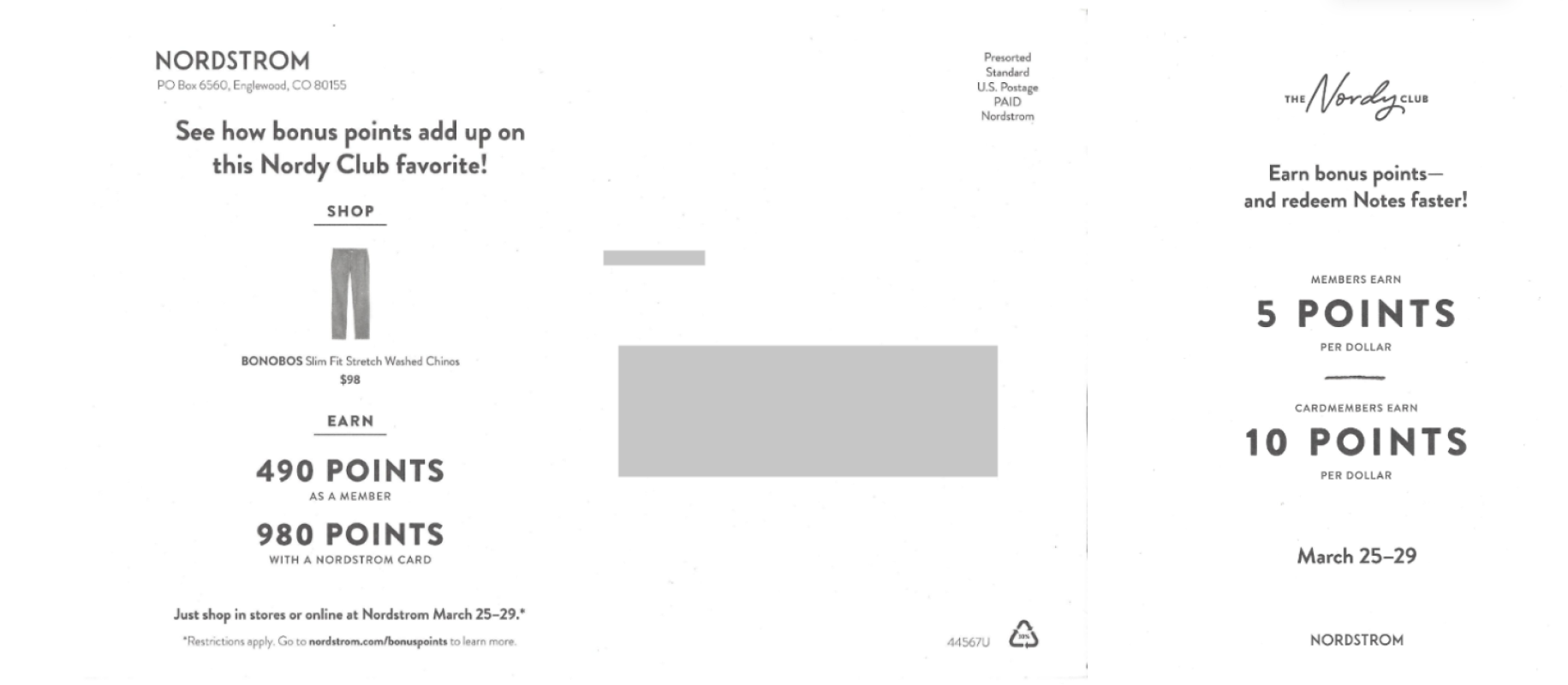
In both cases, the communication aims to persuade people into shopping at Nordstorm with the incentive of receiving bonus points. However, the ’20 postcard takes a more straightforward, “do as you see” approach, instead of using text (like ’12) to show the readers how the reward system works.
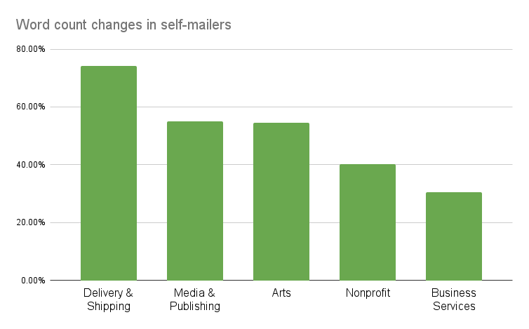
While the average word count for self-mailers decreased across Delivery & Shipping (74.30%), Media & Publishing (54.89%), Arts (54.43%), Nonprofit (40.25%), and Business Services (30.55%), industries like Retail (271.32%), Restaurants (86.10%), Health Care (59.46%), Recreation & Travel (16.67%) observed a significant increase.
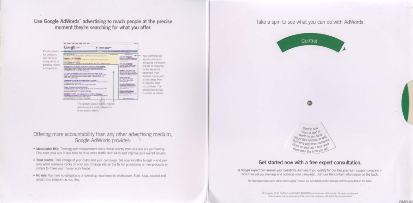
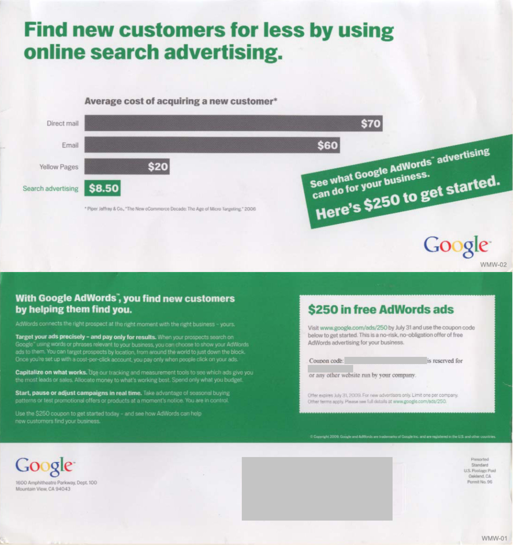
- Consider the following self-mailers from Google. While all of them are promoting the same service—Google Adwords, you can notice a stark difference in copy length between the self-mailers from ’08 and ’20/’21.
Google – word count change
2008
2021
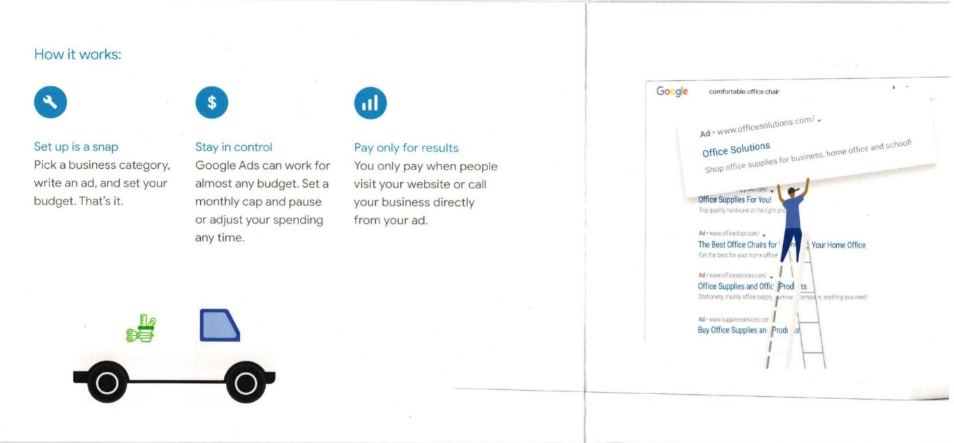
As opposed to ’08, self-mailers from the more recent years rely on lists to present any technical information in bite-sized, consumable chunks. As a result, the difference in word count is apparent.
Both examples also use the snapshot of search results, however, the letter employs a more fun and quirky illustration to get the message across while keeping things light-hearted.
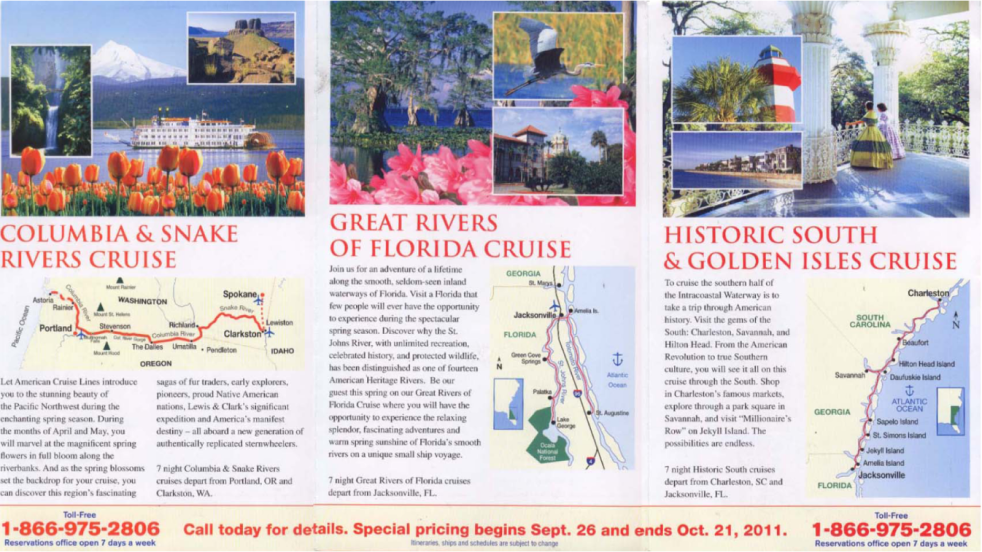
American Cruise Line – word count change
- In comparison, the word count of American Cruise Line‘s self-mailers has consistently increased in the last ten years. Look at the following examples from ’11 and ’21, where the difference in direct mail copy length is apparent.
2011
2021
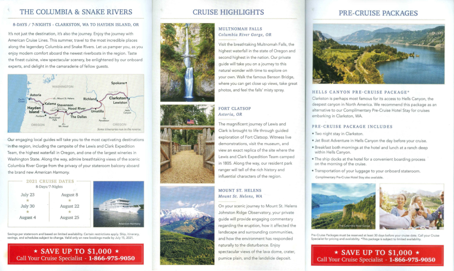
Both of them feature short blurbs about the most notable places that passengers will see during the journey—however, ’21 communicates way more information than that. Apart from answering the most common questions about the itinerary, the self-mailer also shares the many cruise packages you can choose from. They’ve also enclosed a diagrammatic representation of the riverboat, so the readers can conveniently arrange for room-and-board in their preferred arenas.
Long vs. Short Direct Mail Copy: Tips and Tricks
Now that we’ve determined that copy length is heavily influenced by the industry you’re in, the products you’re selling, and the format type you’re using — we can use our newfound insights to narrow down what works best for your brand.
Here are a few tips, and tricks that you should keep in mind while trying to work through the long vs short copy debate for your direct mail.
1. Establishing Credibility
According to an Edelman report,75% of global customers will continue to purchase from a brand they trust, even if the competition seems more appealing. If you’re new to the market and are trying to draw in potential customers, you must display an active interest in the health and welfare of your audience to be considered reliable. There should also be transparency, passion, and consistency in the information you present — which is easier to accomplish when using long copy.
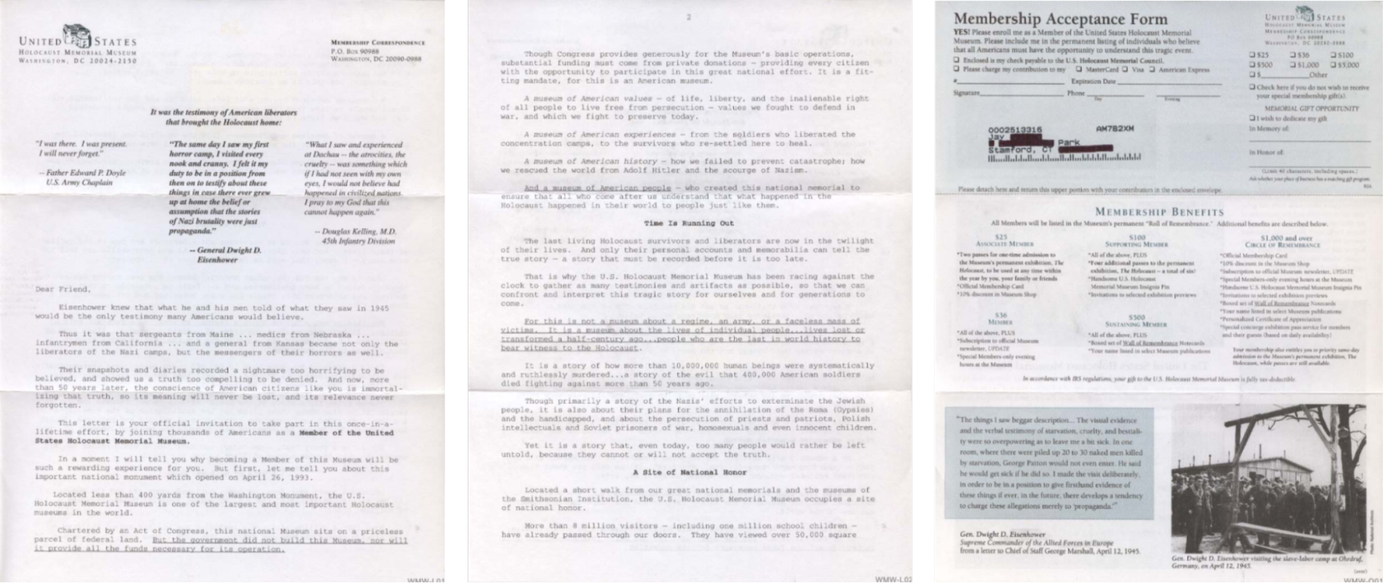
- Consider the US Holocaust Memorial Museum, for example.
In the following envelope from 1998, you can see that the copy is long-form, verbose, and very detail-oriented. At the time, this might have made sense — the museum was established in the 90s, so the authorities had to emphasize the importance of keeping the Holocaust history alive and demonstrate the many ways in which the institution will contribute to the cause.
As a result, the copy includes several talking points, from why the museum is “a site of national honor” to actual first-hand accounts from Holocaust survivors. There’s also a section dedicated to membership benefits that outlines the special privileges you can take advantage of for supporting the museum.
1998
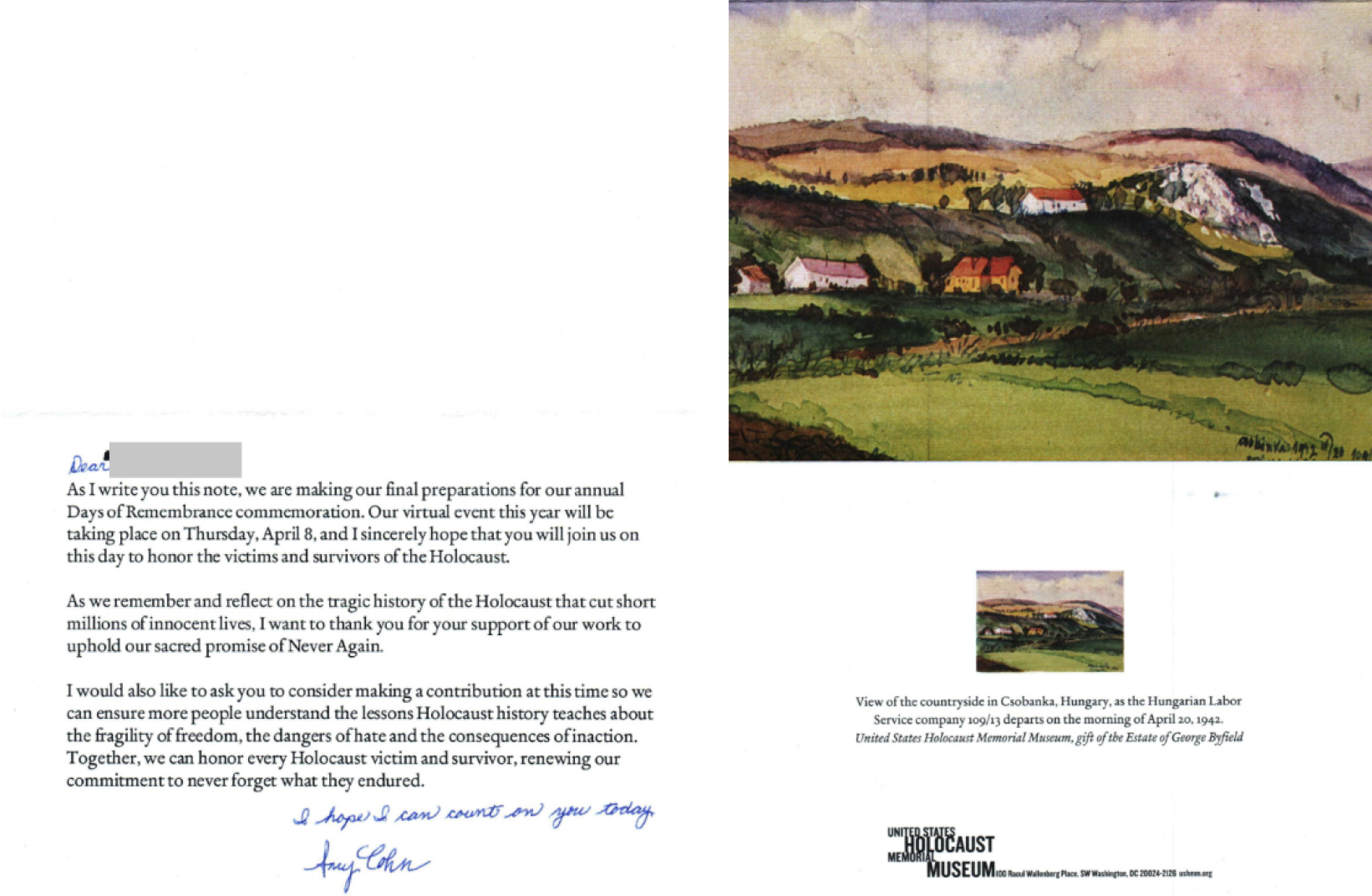
Of course, today, the US Holocaust Memorial Museum doesn’t need an introduction. The 2020 envelope (featured below), doesn’t beat around the bush and instead gets right to the point. They directly address the reader in a short, persuasive, three-paragraph letter informing them about an upcoming event, and encouraging them to make a donation. The envelope also includes handwritten annotations, which adds a personal touch and is also known to improve response rate.
2020
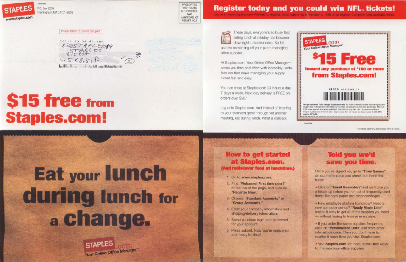
- Let’s also take a moment to compare the copy on Staples postcards.
The company was founded in the late 80s, and much like the US Holocaust Memorial Museum, their earlier postcards spend a chunk of real estate on cultivating trustworthiness. Their 1998 postcard copy delves deeper into what Staples is, and the various products they offer. Since the internet was a fairly new concept back then, the postcard also describes the exact steps a potential customer should follow to place an order online.
1999
Now that Staples is a household name, and most people know how to reach their nearest Staples, there’s been a tremendous change in the more recent postcards in terms of copy and presentation.
2021
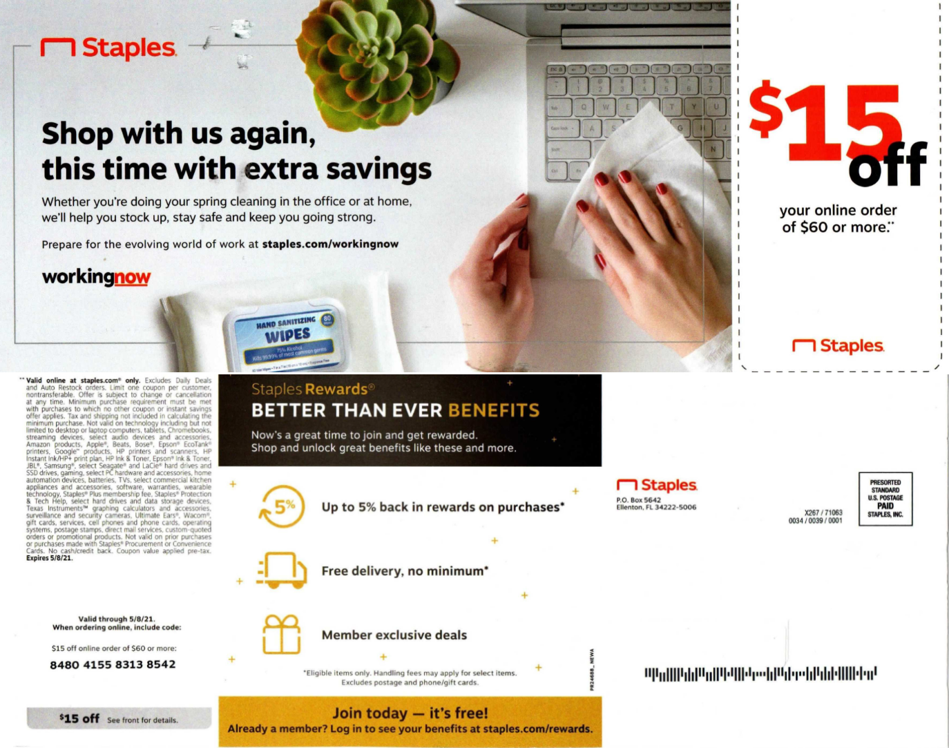
Similar to the ’99 postcard, the postcard from ’21 also advertises an ongoing $15 discount and encourages customers to make a purchase. However, it’s less text-heavy and uses images and other visual elements to engage the reader.
2. Keeping it customer-centric
A SalesForce report found that more than 50% of the customers want brands to anticipate their needs and make recommendations based on their interests. Therefore, regardless of how long or short your direct mail copy is, you must keep your readers (and their needs) at the center of your messaging.
- Look at Google, for example. Between their ‘09 and ‘21 postcards, the former appears to have a higher word count. The copy details the many benefits of using Google Adwords, and one might say, they have dedicated more space than required to hard-selling their product.
2009
2020
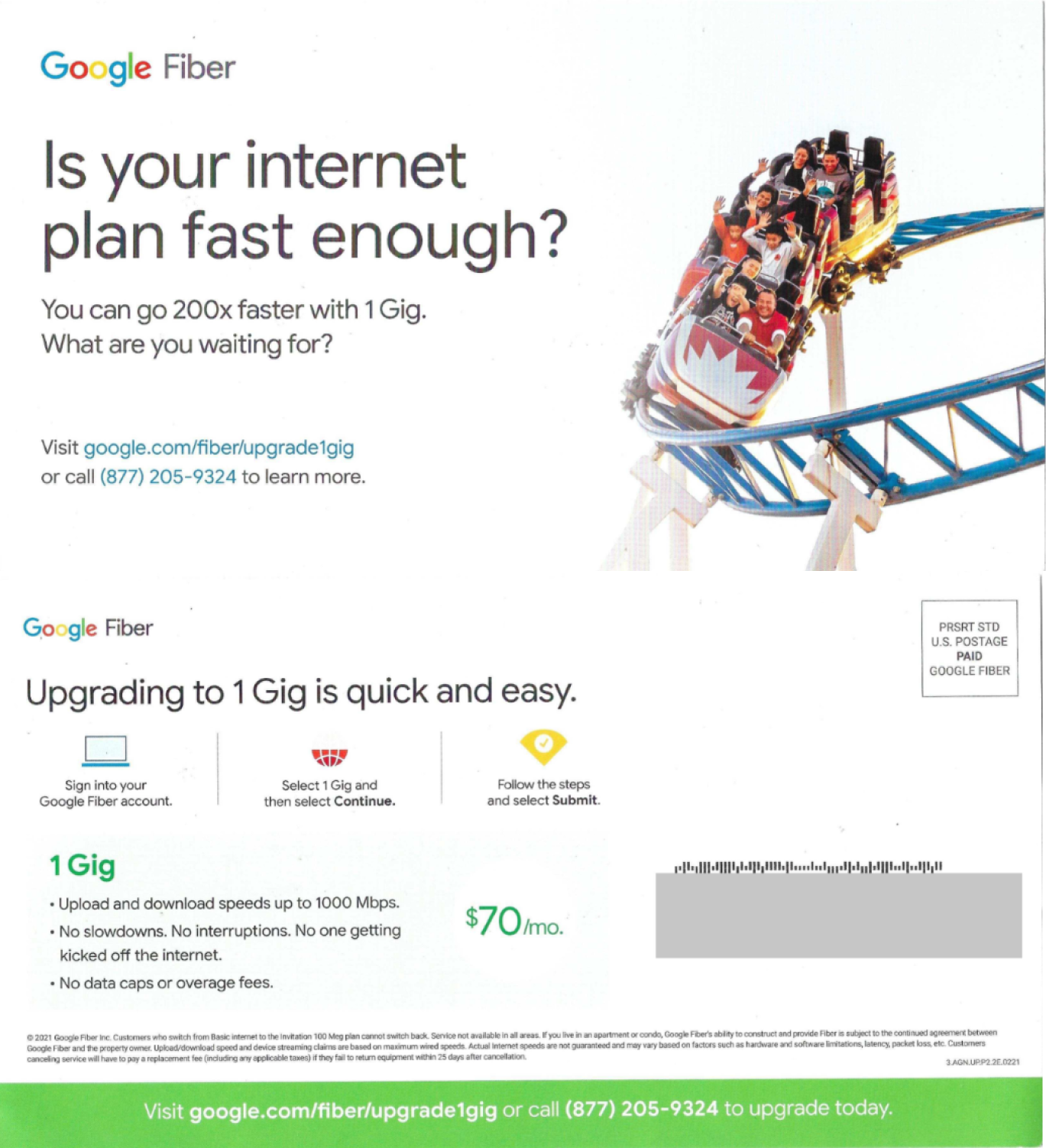
On the contrary, the ‘21 postcard is created keeping customers in mind. They start by addressing the most common customer pain point by posing a simple question—”Is your internet plan fast enough?” In marketing terms, this process is called establishing a problem statement and is often followed up with positioning your brand as the solution.
As expected, when you turn the postcard over, you can see a quick list of Google Fiber plans for people who are unsatisfied with the speed of their current internet plan.
3. Minimizing Distractions
Almost 88% of people in the U.S. admitted to using coupons, and discounts for making a purchase. In fact, 75% of customers prefer brands that offer additional rewards and incentives for shopping. As a result, if you’re a brand running a seasonal offer to drive sales, the odds are already in your favor. You can successfully opt for a short, to-the-point direct mail copy to get the message across.
- CVS is the best example of “Why say lot word when few word do trick?”
The copy on their postcards has gotten exponentially shorter with each passing year. Take a look at the following postcards—all of them are promoting ongoing offers in one way or the other.
2004
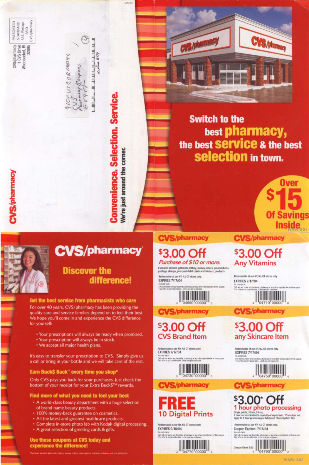
2009
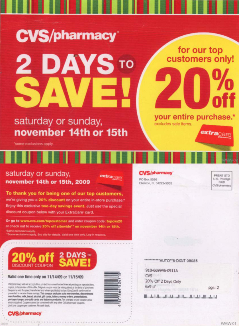
2021
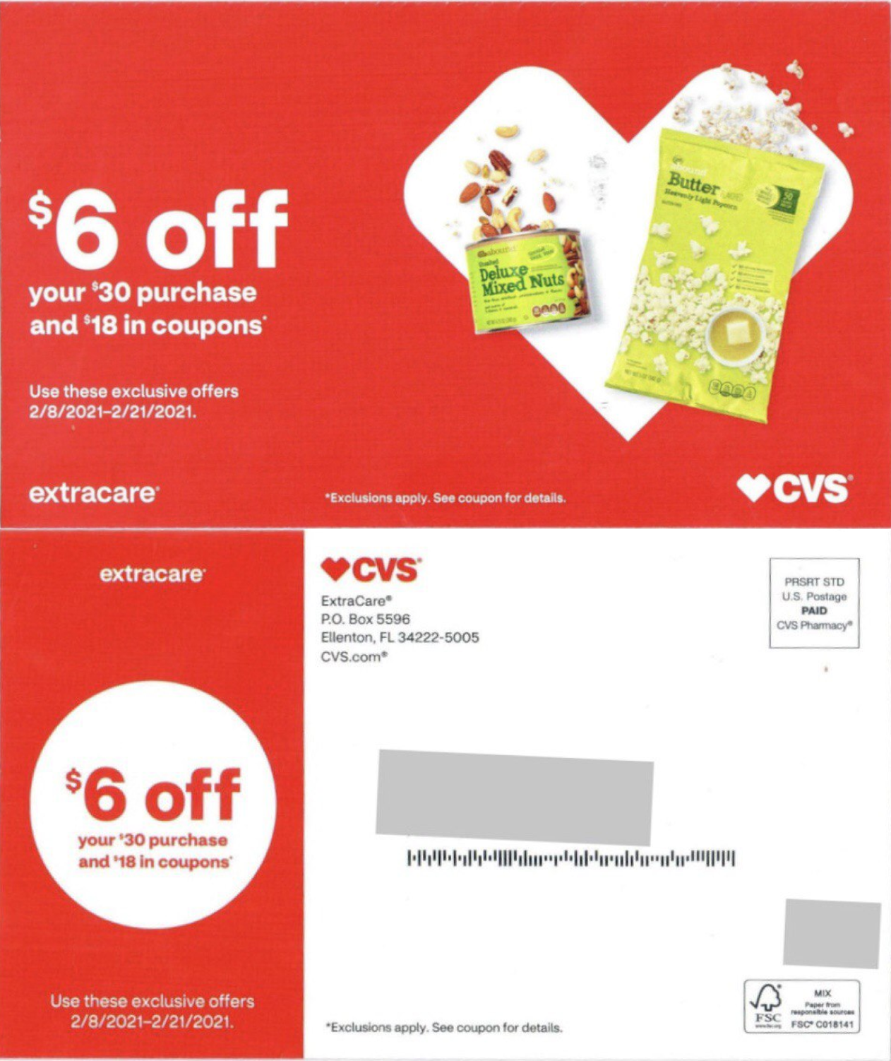
You’d notice that in the first one (from ’04), the company shares the offer and uses lengthy copy to persuade the readers. The second postcard (from ’09) does something similar albeit with a comparatively shorter copy. The third example is more recent (from ‘21) and has little to no copy. It simply mentions the offer and tells people how and when to avail it.
- Petsmart also has a similar approach to direct mail. Take a look at the following postcards from ’04 and ’19 respectively.
2004
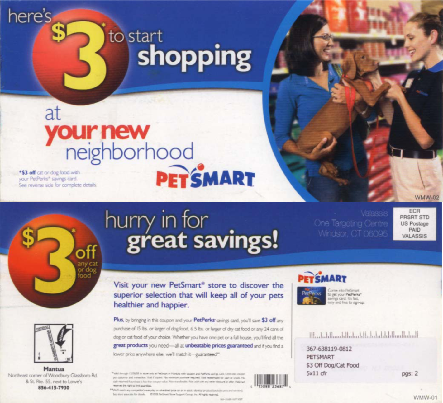
2019
While both of them are pushing for sales, you can see that the company has moved away from using elaborate convincing tactics in messaging. Their postcard copy from ’19 features less than 50 words and yet, manages to get their point across.
4. Presentation Matters
A lot of long vs short copy debates can be solved by working on how you present information.
No one enjoys reading paragraphs upon paragraphs of text — making simple formatting changes like using numbered lists, highlighting certain areas of the copy (with bold/italics), adding a little color (nothing too flashy, of course!) can make a big difference on how well your copy is received.
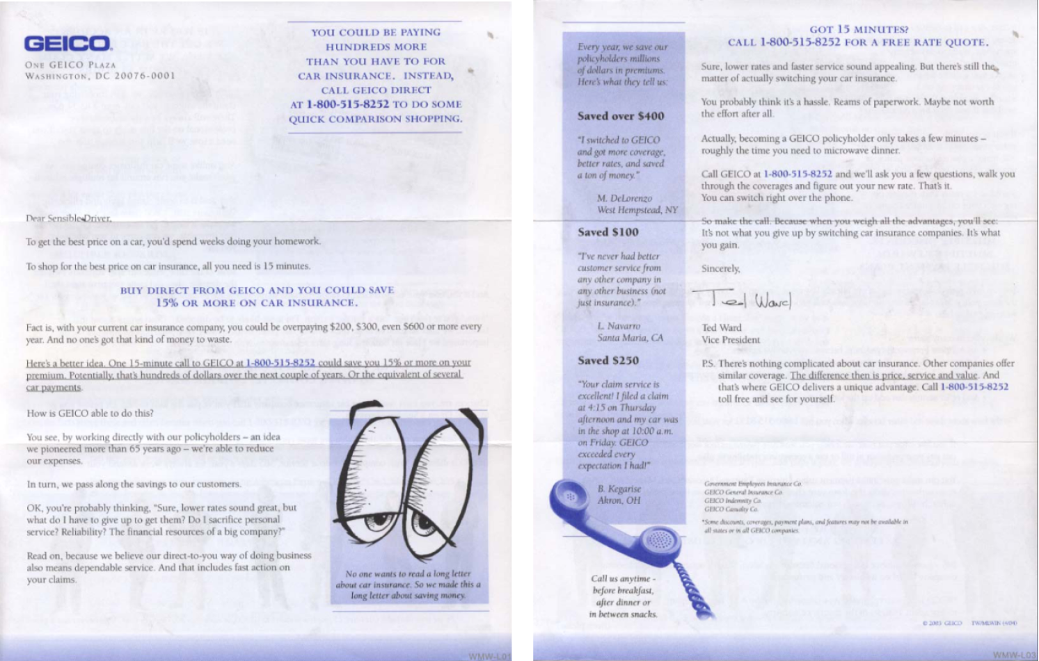
- Even when you have a lot of information to share, as long as the presentation is easy on the eyes, you can get away with having a long copy. Take Geico, for example.
If you look at their envelope from ’00 and ’10, the copy is very comprehensive and spans several pages, however, in recent times it’s gotten a lot shorter.
2000
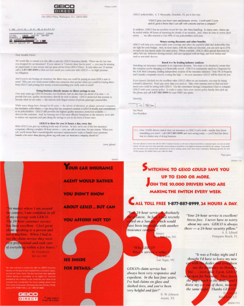
2010
2021
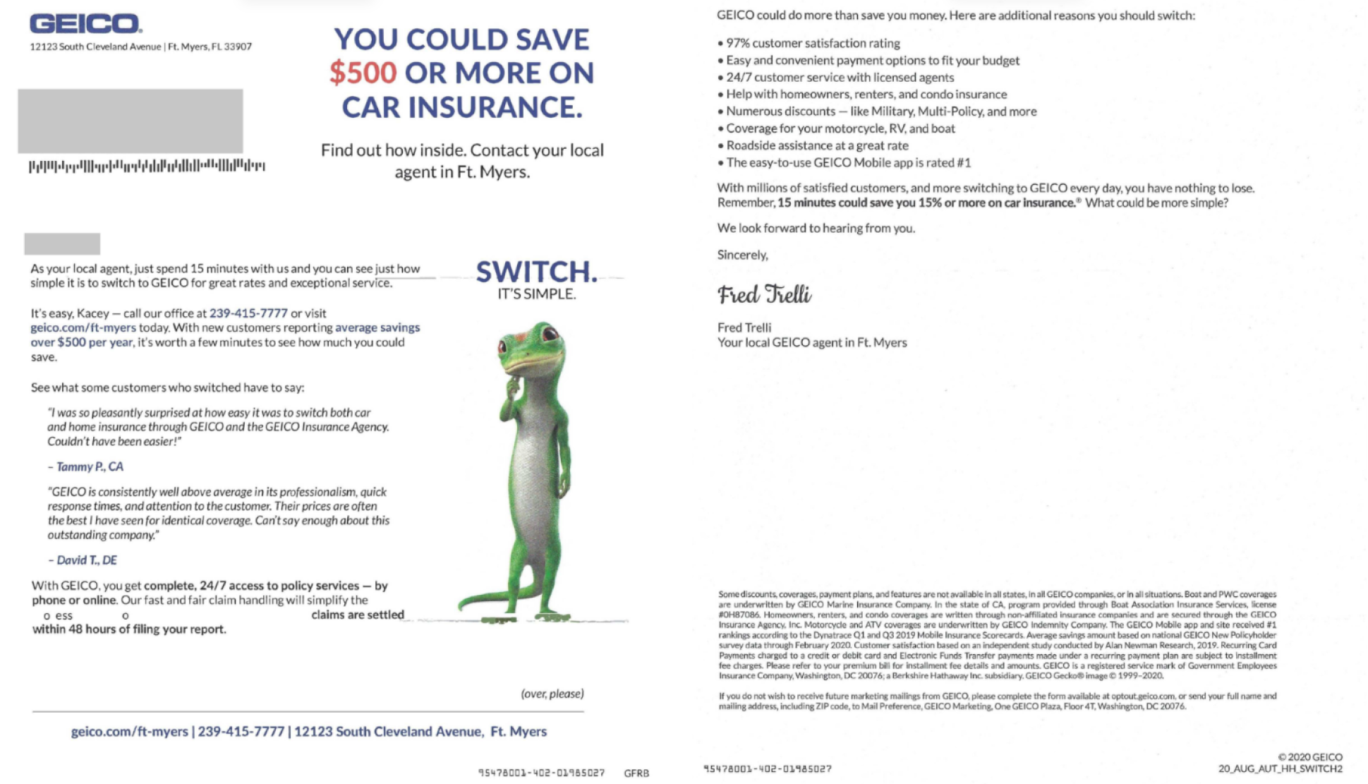
Apart from the newly-minted, snappy tagline (“switch, it’s simple”), they list down concrete reasons for why you should switch to Geico and include contact details. Geico even “put a face to the name” of the sender to personalize their communication.
All of this information is presented in a way that’s easy to read and recall for the reader.
That being said, while the copy got significantly shorter over the years, some of their direct mail components remained unchanged. For instance, all of them feature testimonials and positive reviews from existing Geico customers and how they are benefiting from the company. Not only does this inspire trust in prospective customers, but also gives them a closer look into your many offerings.
More than 90% of people rely on customer testimonials and reviews to make purchasing decisions. By incorporating them in your direct mail marketing strategy, you’d have better luck convincing your prospects to convert.
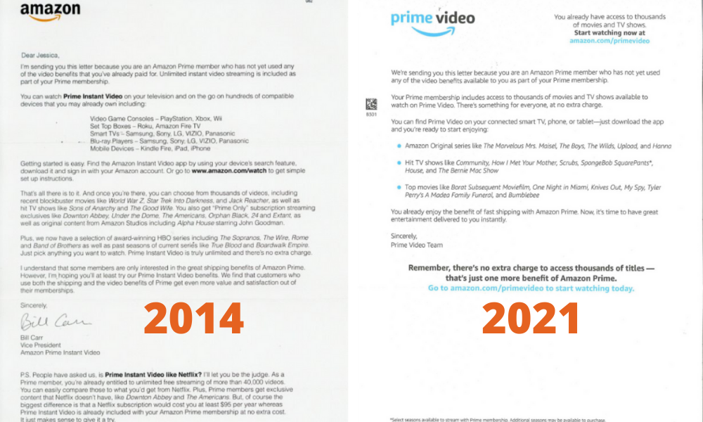
- Amazon is another great example of how presentation directly impacts how your direct mail copy is perceived by the reader. When you compare their envelopes from ’14 and ’21, you’d notice that the latter not only has a seemingly shorter copy but also world’s apart in terms of presentation.
2014 and 2021
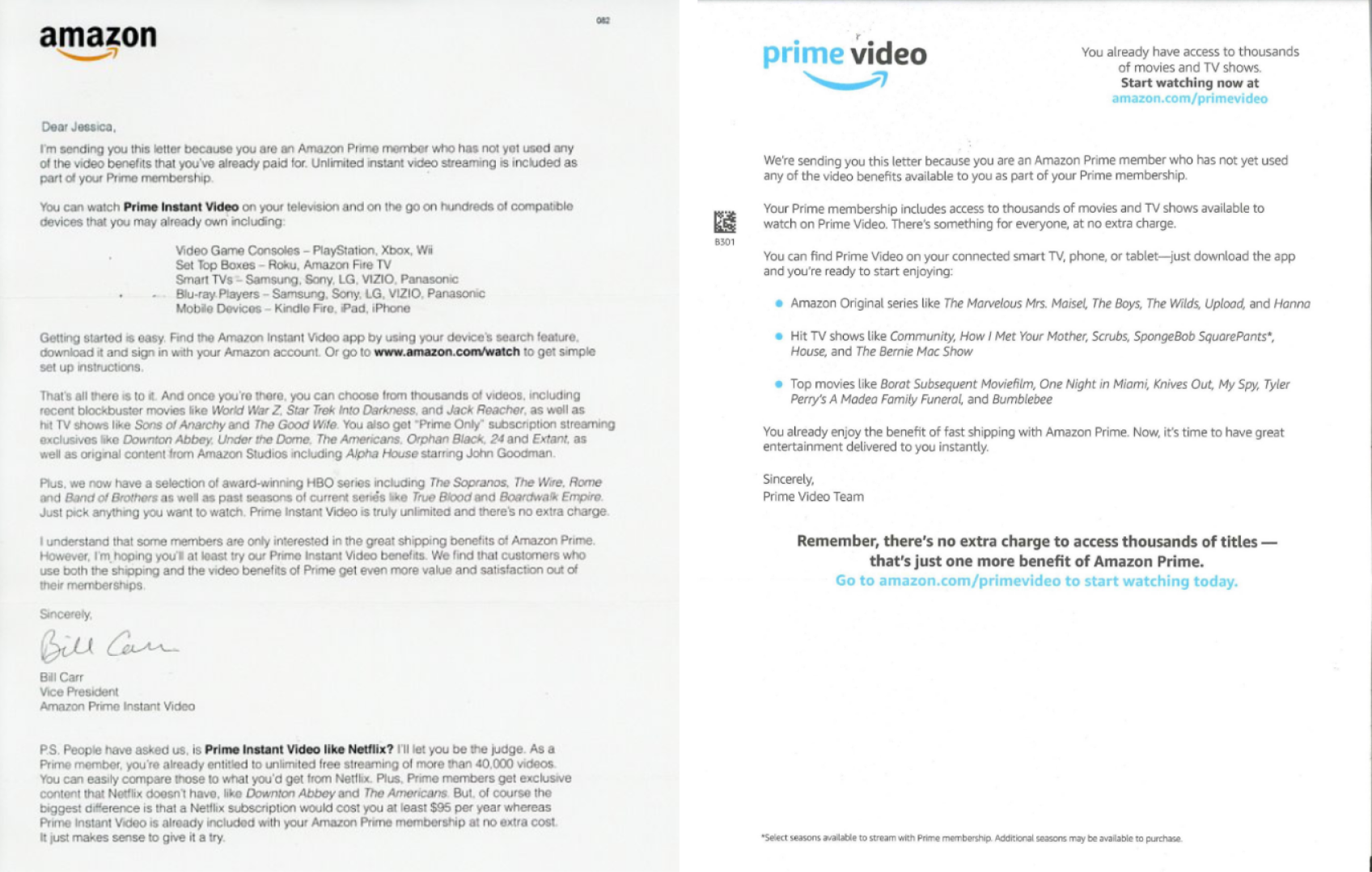
The highlight of the communication is the way they are able to convey several benefits of the Prime membership without sounding monotonous or occupying much space. Instead of using paragraphs like in the ’14 envelope, the ’21 envelope uses bullet points to list all the video content (TV shows, movies, etc) that you can stream after signing up.
The pop of color is a nice touch — not to mention, blue in marketing campaigns is often associated with trust and dependability. When used against a lighter background (like white, in this case) it can be instrumental in drawing attention to the CTA—notice how the Prime link (amazon.com/primevideo) that features in two places is blue.
In Conclusion
While short copy is often plugged as the industry standard, it’s definitely not the end-all, be-all of direct mail communication. Depending on the vertical you’re in and the products you’re selling, many brands are known to benefit from long copy. For example, short copy is perfect when your customers don’t need much convincing (like in Retail), whereas, long copy works better when you have to address several questions related to your offerings (like in Business Services).
A simple rule of thumb, if you’re struggling to make a decision, is to remember that your copy should be “as long as necessary, but no longer“.
The bottom line is being judicious with your copy—creating content that’s engaging, informative, and has just the right amount of oomph that a potential customer needs to convert.
WMW! has an extensive collection of postcards, envelopes, and self-mailer pieces going back to 1984 that help us research and spot trends in direct mail marketing. You can sign up for a free trial and get 10 free campaign views. Register now!


Ken Schneider
September 21, 2021 at 5:19 pm
I’ve been writing direct mail copy for over 40 years, and I’ve written long copy, short copy, and in-between copy with success. It really does boil down to the decision as to what is required to “tell the story.” I’ve used 6-page letters, 4-page letters, 2-page letters, and no letter (just a long copy brochure.) The key is knowing who you’re selling to, and what they need to know to convince them to create a positive response. The offer is also a factor. A high-priced product probably needs longer copy. I always think of it this way: if I was locked in a room with a prospective buyer and the only way out was to get him or her to place an order, what would I have to say, how would I have to say it, what approach would I take, should I flatter or guilt-trip, should I be friendly or authoritative, etc., etc. All of that would determine the length of my pitch. Just as, so too with writing copy. I enjoyed the article.